
Graphic Elements

Our visual system is based upon the geometry of the block U. We have distilled it to three flexible approaches to accommodate assorted communication channels.
Graphic Examples
"Slices"


"Rising"


"Simplified U"


Graphic Moves

This arrow and line device is used to lead the eye into body copy. It should always begin at the border of a page. Using this element gives the piece a feeling of forward momentum and progress. The line is also used to carry the reader across the page (as a timeline of sorts), highlighting content along the way.


Compartmentalization brings a level of organization and structure to the U of U Health brand. Use containers to highlight small bits of information, like a call to action, website, or statistic. Use rectangles with rounded corners (radius .0278 in for InDesign, and 4 px for web design) to soften the container and make it more inviting. To contrast with the body copy, the containers should be outlined in red, and the type within them should be in all caps.


Transparency can act as metaphor for the knowledge we convey as an acdemic medical center. Transparency can also act as a graphic device to inject communications with our brand color. It can also provide an even tone over photography to support information that can be reversed out in white.

To give viewers a glimpse into “slice-of-life” moments, you can compose slivers of images into a timeline-like series. Whether it’s a child playing, a doctor performing surgery, or a researcher collecting data, these moments are what make life—and our careers—worth it.

You can show changes and progress through the use of sequential photography. Use a series of moment- by-moment photos, each one slightly different than the one before it. This photographic treatment shows how each small discovery and alteration makes a large difference over time, just like scientific research at U of U Health.
Icon System
Our icon system is simple, clear, and open. Each icon has a few key things in common with the rest of the set. They show objects from the front and use flattened perspective whenever possible. This standard icon set was created to enhance call outs in marketing materials, website, and advertisements.
Essentials
Creating Icons
Standard icons must be created to spec to ensure they work with the existing set. For consistency, keep within these format dimensions. Line stroke weight should be 1pt with rounded corners and caps. 50% grey is preferred on white background, however red, black or white (on colored backgrounds) are accepted.
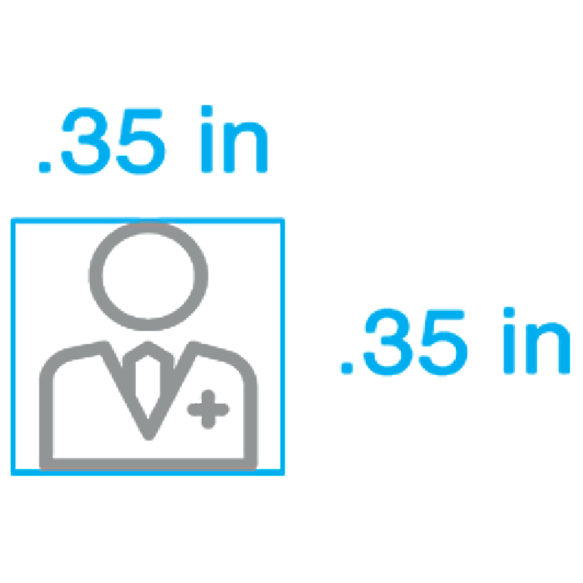
Square
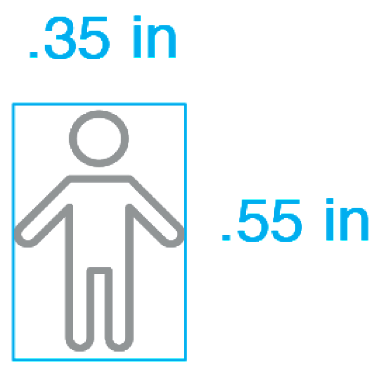
Vertical
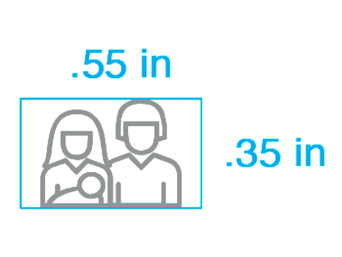
Horizontal
Illustration
Illustration can enhance communications. It can make infographics immediately comprehensible, illuminate publications and editorial content, visualize complex concepts, and so much more. A wide variety of illustrative approaches and styles are available. Following are some approaches we recommend, and contexts where different types of illustration perform best. Illustration may be commissioned by artists or designers, or even licensed from professional stock agencies. When illustration is procured, it must be done within full copyright compliance.
Flat


Flat illustration is minimalistic and modern. It uses clean lines and crisp edges, open space, bright colors and a two-dimensional effect. It allows complex objects to be conveyed in outline or silhouette while still making the subject instantly recognizable. This approach keeps the focus on content without distracting the audience with flashy visual effects.
Semi-Flat


Semi-flat illustration uses the same attributes as flat illustration, but incorporates subtle visual effects. It might use simple color blocking, tints and shades, modest gradients or color transitions, or subtle textures and patterns. Semi-flat design suggests realism without needing to render high-contrast shadows and highlights, 3D effects such as ultra-real textures and patterns, or painterly color and other embellishments. It brings a little more dimension and distinction to illustration while maintaining an ease of read.
Conceptual


Publications and editorial content might turn to more conceptual and expressive approaches, such as these samples from Algorithms for Innovation.
Medical


Realistic illustration is beneficial for educational content, such as these medical illustrations.